Half Bath Before & After
Hey ya’ll, have we got a fun one for you!
While this room has been functional for quite a while, we finally got around to donning our kitchen half bath with a bit of décor, so we figured it was the perfect time to show you an official before and after of the space!
Way back when, when Charlotte House was bustling with house parties and beach sand (that’s a whole ‘nother story), there were no actual toilets on the ground level. “Reportedly,” the boys used a small closet for a urinal, and there was no shortage of watering the shadowy trees outside, but truth be told, there was no porcelain for a proper lady squat.
As several of us here now have lady bits and an appreciation for hygiene, one of our first orders of business was to figure out where to add a half bath or two on the first floor.
Once we moved the kitchen over to the former dining room, we had lots of space to utilize in the original kitchen, and we knew we could hook into the plumbing that was going in directly about it in the new Primary suite. This spot was also located just off of the mudroom, so we knew it was the perfect place for the new downstairs potty.
Before/During/After
In the first slide, you can see the original kitchen painted in that signature Kappa Sigma red, complete with the Greek letters on the wall. There was a commercial grade
eyesoreexhaust fan mounted on the exterior, but it had clearly not been hooked up to anything inside for quite some time.The middle slide shows the gutted space, plus the arched window that was hidden behind the kitchen wall. That window is now part of the utility room that lives behind the half bath, and you can see Andrew hanging out with the new framing that separates those two spaces. We also loved the brick once we saw it, and knew we wanted to clean it up and keep it exposed in this space.
Finally, you can see the same view in the last picture, all fixed up and ready for hineys! This bathroom is a workhorse that sits just off the kitchen and mudroom, and we carried a lot of the same design elements into the latter – tile, shiplap, exposed brick, and wood counters all continue into the mudroom for a cohesive look.
Our Favorite Features
Exposed brick: there are only a few walls where we decided to keep the brick exposed, and this room was one of them. We love the texture, and it gives the room an indoor/outdoor feel that also shows up in the neighboring mudroom.
Star-tiled floor: it’s a trick! This flooring looks old, but it’s actually brand new and designed to look like it’s been through a few things. (view it here)
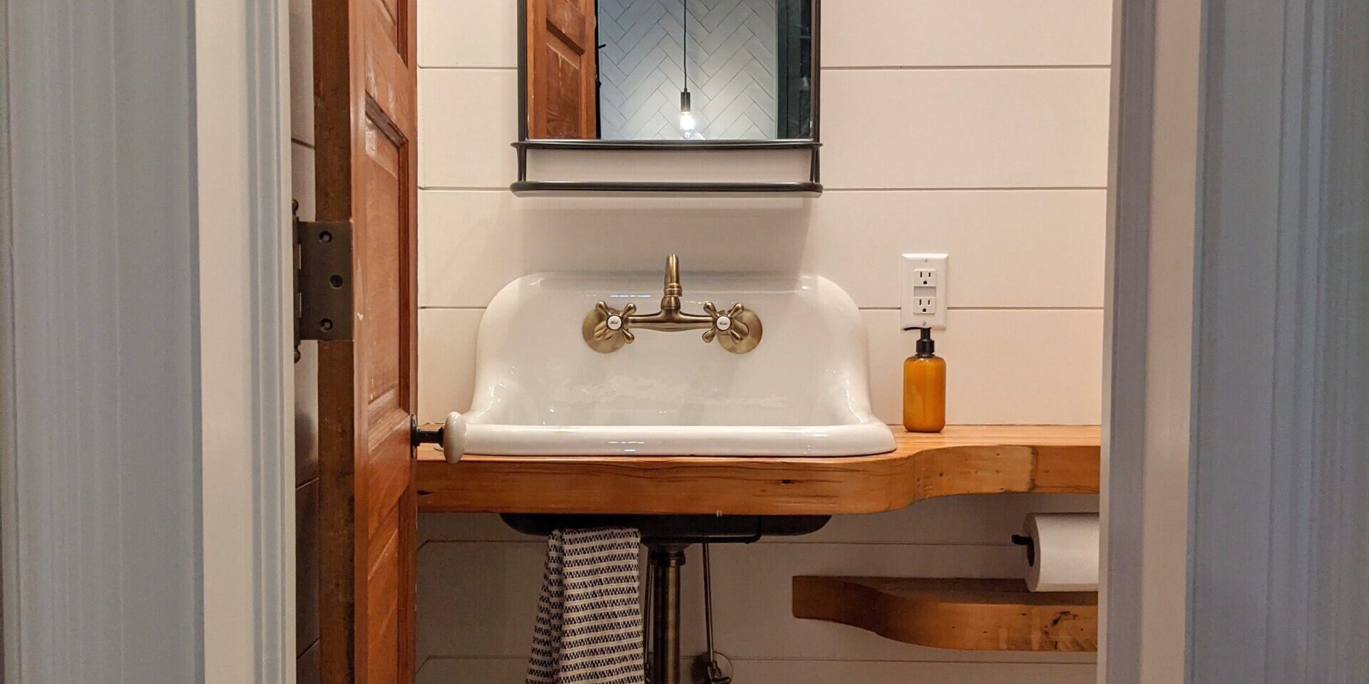
Custom, salvaged-wood countertop: We should call these counters the Pineberry Special – our contractor, Andrew from Pineberry Remodeling, crafted these from wood that was salvaged from previous demolition upstairs. The curves are to.die.for. and we have similar versions of these countertops peppered throughout the house.
Cast iron sink: there are no shortage of Facebook Marketplace finds around here, and this sink is one of them. We needed to finagle the drain a bit (it’s sized for a kitchen drain rather than a standard bathroom drain), but the sink gives the room just the right vintage touch we were looking for. And it was cheap! Holla!


Where to Find It
Links to all the goodies!
- Wall-Mount, Ribbed-Glass Cabinet (we can send you a $20 Off your first order link, just comment “Code Please” below if you’re interested and we’ll hook you up!)
- Turkish Hand Towels (these are the “Zipper” design)
- Vanity Mirror
- 2-Bulb Light Fixture
- No-show Built-in Toddler Toilet Seat
- Two Step Foot Stool
- Faux plant (you’ll need to wrestle with it to look good, but don’t give up!)
Looking for something we didn’t link? Comment below and we’ll share the source if we have it!


Leave a Reply